What does the Left look like?
Clive Palmer bought every billboard in the country. Bluey conquered the world. Somewhere between them is a design brief - and it belongs to Aussie artists.

I should say up front: I don’t know the answer to the question in the title. This post is an exploration, not an argument, and by the end I’m going to hand the problem to you - because if you’re a designer, a visual artist, an illustrator or a scenographer, I’ve come to believe this is your problem, in the best possible way.
Ezra Klein has raised a version of this on his podcast more than once: the sense that the modern Left has policy but no vibe - no visceral, instantly legible visual language - while the Right has quietly become fluent in aesthetics. I keep turning that over in an Australian context, because here the evidence is painted a hundred feet high on the side of the Bruce Highway.
The Right can see. Can we?
Consider hazard yellow. In the 2022 federal election, Clive Palmer spent an estimated $100 million - some analyses put it above $120 million - saturating every newspaper, ad break, billboard and feed in the United Australia Party’s blinding yellow. He won one Senate seat. Pundits called it a failure, and electorally it was. But as a design intervention it was chillingly effective: there is not an Australian alive who cannot summon that yellow, that font, that register. Yellow is the highest-visibility hue in the spectrum - it’s why we use it for wet-floor signs and earthmoving equipment.
One Nation runs deep orange - hot, urgent, unmissable - and it rhymes internationally with the entire Trump palette: the garish flag-drenched everything, the gold lettering, the UFC octagon he keeps appearing beside. It’s easy for people like me to sneer at this as tacky. That’s the mistake. The tackiness is load-bearing. In an era when audiences are exquisitely tuned to detect focus-grouped polish, garishness signals authenticity: nobody managed this. No consultant approved this. What you see is what you get.
It works more in Australia too - because we equate working-class qualities with an essential Aussie aesthetic. It’s why Hanson and Joyce posed over an office steak lunch, complete with Saxa salt. The salt container, her hair, the picture behind them, his skin - all red.
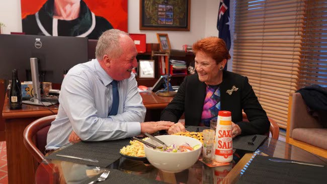
The Right’s aesthetic isn’t an accident of bad taste. It’s anti-polish signalling, and it works on the same audience that distrusts anything that appears too rich, too smooth, too laundered. Which is awkward. Because “too rich, too smooth, too laundered” is a fairly accurate description of the contemporary Left’s entire visual output.
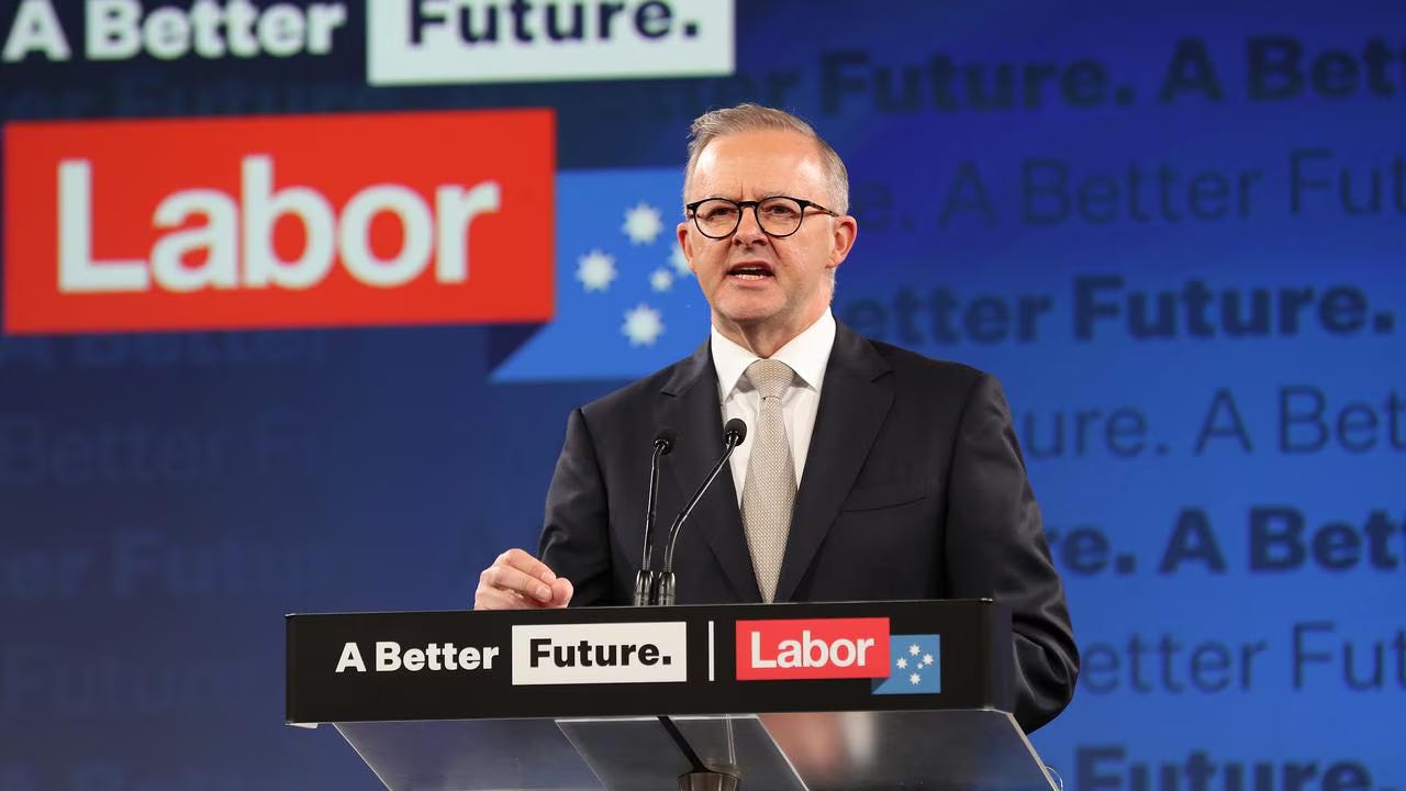
The corporate cleanliness problem
Look at almost any government communication, Labor campaign material, or progressive NGO brand from the past fifteen years. Sans-serif humanist typeface. Generous white space. A muted palette tested to offend no one. Diverse stock photography, softly lit. It is the aesthetic of a superannuation fund - clean, competent, and utterly without blood.
I understand how we got here. Cleanliness reads as trustworthiness; institutions communicate in institutional voice. But I’m not convinced it’s still true for this generation, who have grown up marinating in exactly this register - every bank, university, and data-harvesting app speaks fluent Corporate Clean. For them it doesn’t signal trust. It signals a brand is talking to me, and they stop listening.
Here’s the thing though: it wasn’t always like this, and the exceptions are instructive.
When the Left had a look
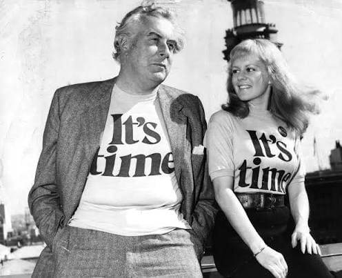
In 1972, Labor’s It’s Time campaign - conceived by creative director Paul Jones - put Jacki Weaver, Graham Kennedy, Little Pattie, Col Joye and half the entertainment industry in a studio to sing a jingle, wrapped the whole thing in warm optimism, and changed Australian political advertising forever.
Note what it was: not a policy document but a feeling, carried by artists. The National Film and Sound Archive still ranks it among the best-remembered ads in federal election history. The Left won the culture first and the election second.
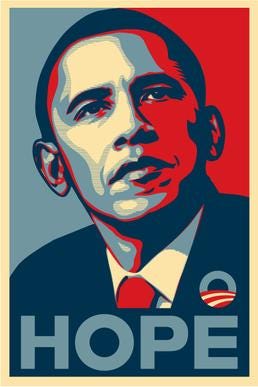
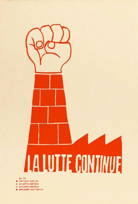
In 2008, Shepard Fairey’s HOPE poster did something similar for Obama - and crucially, it came from a street artist, not the campaign. It looked handmade, screen-printed, faintly illegal. People remixed it endlessly, which was the point: an aesthetic loose enough to be owned by its audience. Go back further and you find the Atelier Populaire of May ‘68 - art students occupying their own school to screen-print posters they refused to sign or copyright, because the images belonged to the movement.
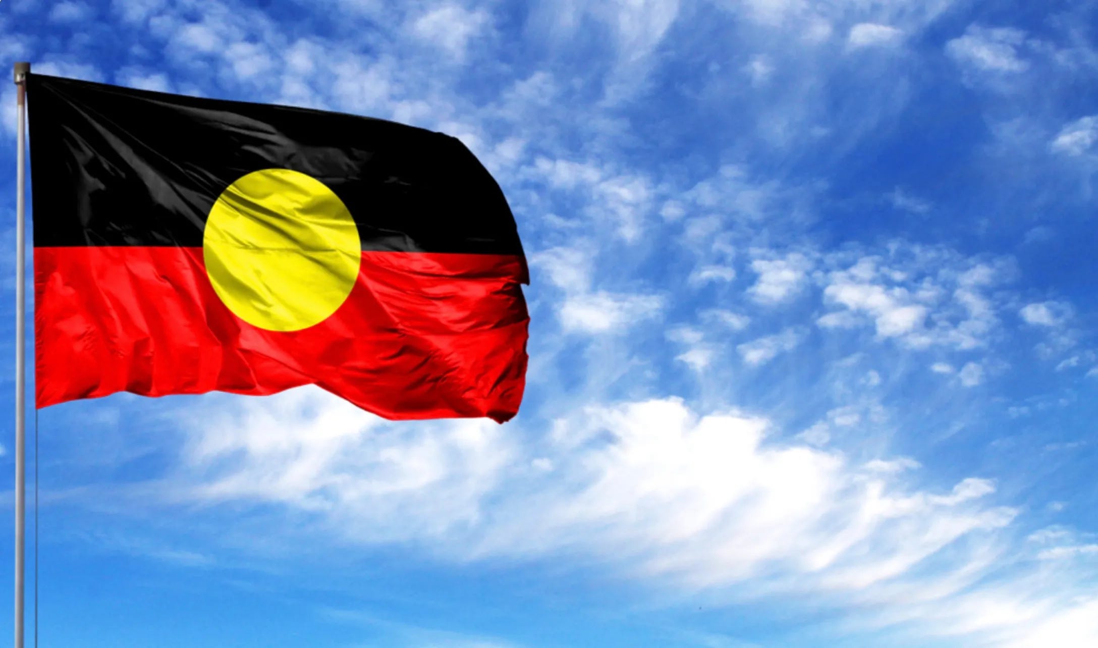
And here at home, the single most successful piece of Australian graphic design of the past century arguably belongs to this tradition: Harold Thomas’s Aboriginal flag. Three colours in perfect symbolic economy - black for the people, red for the earth, yellow for the sun. Designed in 1971 by an artist, adopted by a movement, now so culturally central that the nation paints it on bridges. No corporate consultancy on Earth could have produced it.
The pattern in every case: the aesthetic came from artists, carried genuine feeling, and was porous enough for people to take it and make it their own. The corporate-clean era inverted all three.
So what’s quintessentially ours?
If an Australian Left aesthetic is going to exist, I don’t think it gets invented from scratch. I think it’s already lying around in pieces. A few of them:
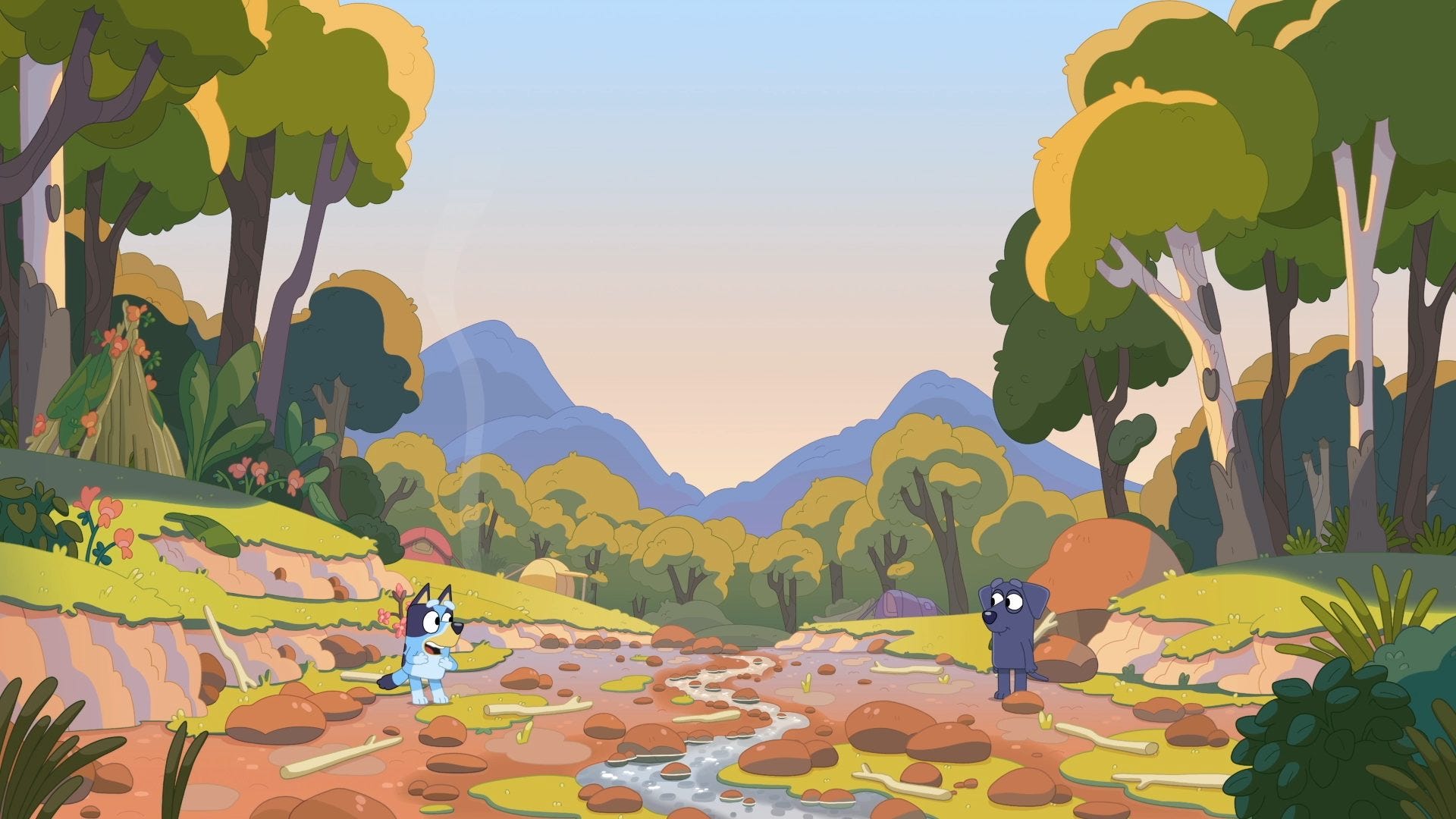
Bluey. Joe Brumm’s Brisbane - the watercolour light, the jacarandas and poincianas, the backyard cricket and creek beds - has become, almost by stealth, the most globally beloved rendering of Australia ever made. Its design language is soft naturalism: real suburbs, real light, drawn with enormous warmth. There is something quintessentially Aussie in it precisely because it isn’t selling anything except the proposition that ordinary Australian life, closely observed, is beautiful.
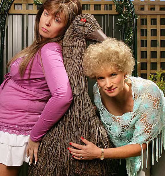
Camp. We are one of the great camp cultures - Kath & Kim, Priscilla, Dame Edna, Mambo and Reg Mombassa’s snarling larrikin surf-satire that ended up in the Sydney 2000 closing ceremony. Australian camp is our licensed pressure valve: it lets us be sincere by being ridiculous. It’s also a genuinely Left-coded aesthetic asset the Right cannot use, because camp requires self-awareness and authoritarianism has none. Clive Palmer and Pauline Hanson can be called many things - funny isn’t one of them.
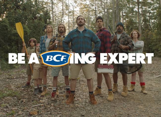
The Bunnings/BCF register. Yes, there’s a bogan aesthetic - hi-vis, snags, utes - and the commentariat treats it as the Right’s home turf. I’m not so sure. Look at what BCF actually sells: boating, camping, fishing. The entire register rests on a love of the natural world - the coast at dawn, the river, the campsite. The sausage sizzle out the front of Bunnings is one of our few universal civic rituals; we literally call voting day’s icon the democracy sausage. This is communal, egalitarian, outdoors, unpretentious. Squint, and it’s practically social democracy in thongs.
Country. And beneath all of it, the oldest and deepest visual language on the continent - 65,000 years of First Nations art and design, which understands land not as scenery but as kin. Any honest Australian aesthetic is in conversation with this, on First Nations artists’ terms and never as wallpaper.
Interestingly, the one recent movement that understood colour as strategy came from the centre: the teal independents, who invented a hue precisely between Liberal blue and green, and rode it into parliament. Whatever you think of their politics, that was design thinking - proof that in Australian politics, a colour can still do work Palmer’s millions couldn’t.
The brief
So here is where I land, which is to say: at a beginning, not a conclusion.
The tall poppy in us distrusts anything too rich. The larrikin in us distrusts anything too earnest. The corporate-clean aesthetic fails both tests, and the Right’s hazard-yellow rage-palette passes the first while weaponising the second. The space that remains - warm, funny, unpolished, communal, in love with this country’s actual light and land - is enormous, and it is almost completely unoccupied.
I don’t think a party comms unit can fill it. Every historical example says it gets filled by artists first: a Paul Jones, a Shepard Fairey, a Harold Thomas, an atelier of students with a screen-print rig. Which means this is a job for the sector I write about every week — the same one we are systematically defunding, which is perhaps the most self-defeating detail in this whole story. A movement that starves its image-makers should not be surprised it has no image.
So, designers, painters, illustrators, animators, scenographers - consider this an open brief. What does an Australian politics of warmth look like? Show me the poster. I’ll put it on the fridge, right next to the kids’ drawings and the Bunnings receipt.
I mean it, by the way. If you make something, send it to me. Maybe the next post should be a gallery.
For the Left, to have an advertising campaign it needs to know what it represents, and I don't think it does anymore. When Amnesty international can accuse a rape crisis centre in Glasgow as denying Human Rights - I personally think the Left has lost the plot. Which breaks my heart. it's become something for the Woke, White Middle Class. Where people collapse instead of discuss, where if you don't agree with someone it's okay to cancel them, sending death threats to women is okay. I don't understand.
indeed neo Cons labelled 'left', 'right';'green','liberal'or even..
'progressive'... are void of policy that centres humanity ( Art/ culture/ reality / truth in the human condition and recognize and respond! Despite the ugly Truth; Not perception- policy must protect people - democracy !